 English
 Français
Introduction
This illustrative tutorial is a simple case about a user, John, who intends to buy a new car. To get a quick overview, take a look at the video below or keep on reading for detailed explanations.
John is actually hesitating among six different models. Those are:
- a BMW 1 series,
- a BMW 3 series,
- an AUDI A3,
- an AUDI A4,
- a Volvo C30,
- a Volvo S40.
Buying a new car is not an easy task. Indeed, one usually takes into account multiple criteria when comparing the models. In this case, John is considering the following criteria:
- the price of the car,
- the power of the engine,
- the acceleration capacity (eg. the time it takes to go from 0 km/h to 100 km/h),
- the consumption,
- the CO2 emissions.
The cars represent the different alternatives. They are listed in the "Alternatives" tab of the start interface (Figure 1). The criteria are listed in the Criteria tab (Figure 2).
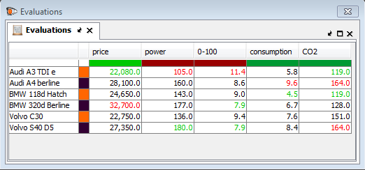
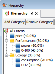
The Evaluations tab, represented in Figure 3, is a grid that contains an alternative in each row and a criteria in each column. Basically, the values in that table represent the performances of the cars for each of the criteria. To keep things simple, John decided to group the power and the acceleration in a "Performances" category. The consumption and the CO2 emissions are gathered in the "Ecology" category. This is shown in Figure 4.
Analysis
By going into the menu Analysis -> Visualization -> Global Visual Analysis (or by typing CTRL + G), you open a visual representation of the decision problem. In this chart, the cars are represented by the points and the criteria are represented by the axes.
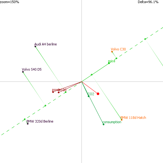
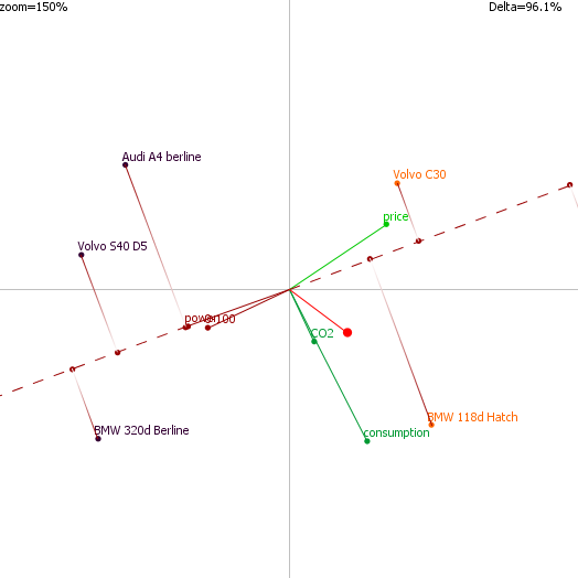
If an alternative’s projection is high on an axis (click on the axis extremity to display the projections), it means that it performs well on the related criterion. For instance (see Figure 5), the Audi A3 is the best car regarding the price (the cheapest) and is followed by the Volvo C30. On the other hand, the A3 is not good on the Power criterion. The BMW 320d is the best for the power criterion (eg. the most powerful), as illustratedin Figure 6.
If two axes are oriented in the same direction (and thus are close to each other) that means that the related criteria are correlated. On the other hand, if two axes point in two opposite directions, it means that the related criteria are anti-correlated / in conflict. This can be observed for the price and the power that go in opposite directions. This means that on average and for this specific set of cars, the most expensive cars have the best performances. This may sound logical and it is positive that this can be observed on this graph. But let’s emphasize that the configuration only depends on the data. Another interesting point that can be observed on the graph is related to the green axes that one can see in between the prices and performance axes. Those are the ecological axes and one can see that there are some cars that can be high-performing and ecological. Those two cars are the BMWs.
The red axis (the one without label) represents the so-called “decision stick”. It represents the direction of the preferred car. Indeed, it is computed with the weights given by John and represents the compromise he wants to make among the different criteria. Projecting the cars on this axis (right click on the chart then click on “Stick projections”) will give a visual representation of the ranking as shown in Figure 7. We can see that in this case, the preferred cars are the ones represented in orange. The two best scored alternatives are the Audi A3 and the BMW 1 series.
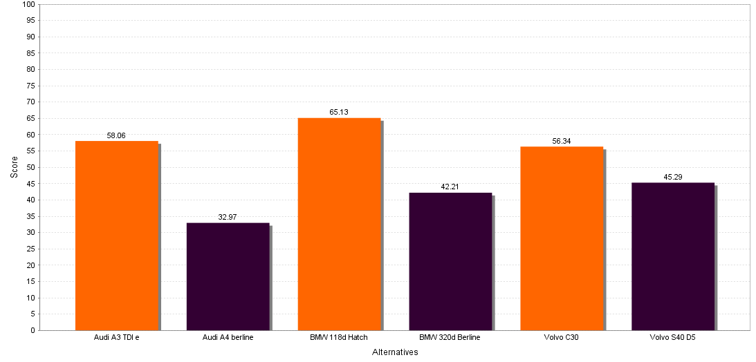
If we open the Global (numerical) ranking by going in into the menu Analysis -> Ranking and click on the Ranking menu item, we get the numerical ranking of the different alternatives. The preferred car is the BMW 1 series with a score of 65,13 followed by the Audi A3 with a score of 58,06 (see Figure 8).
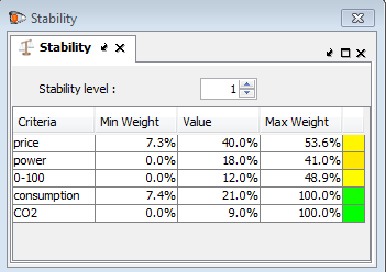
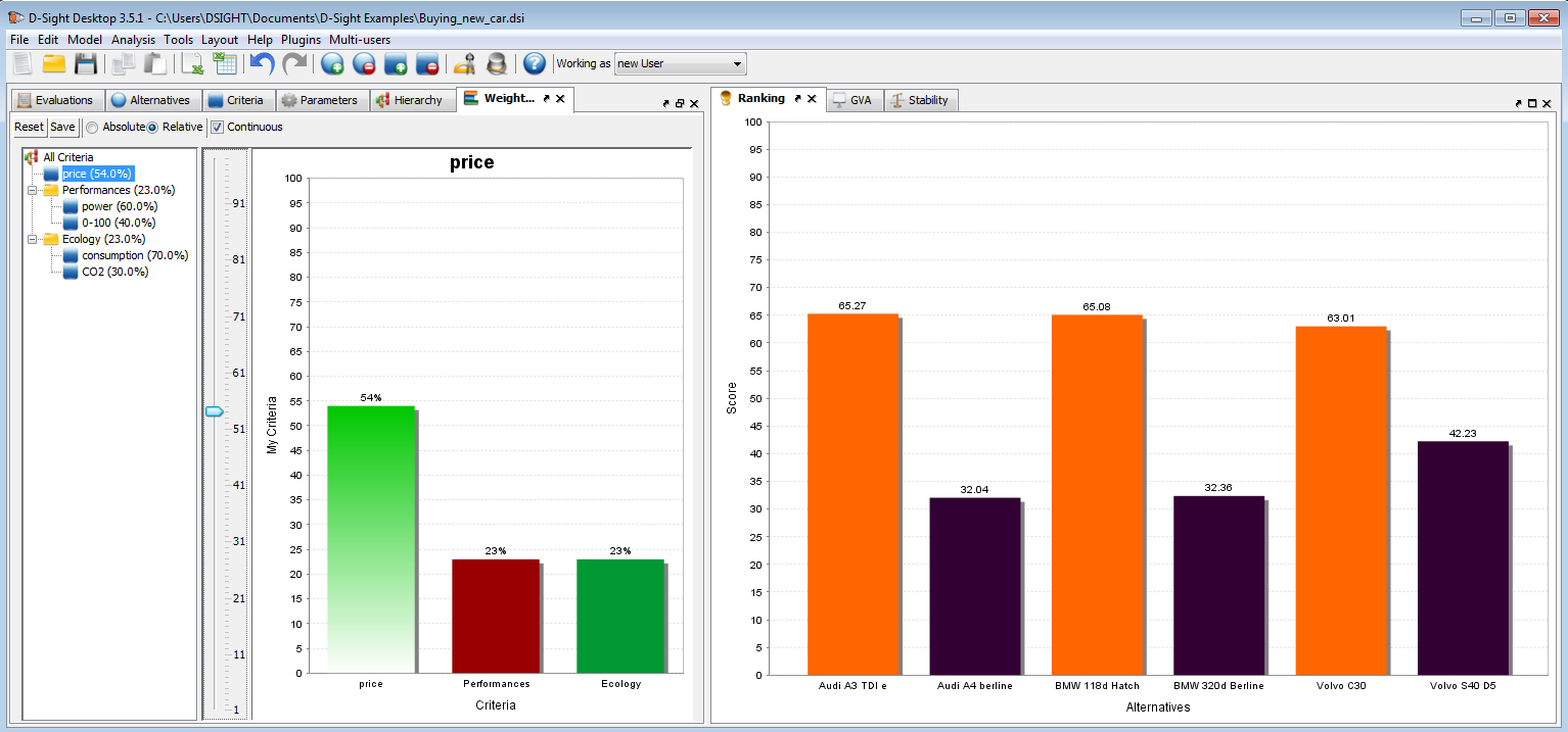
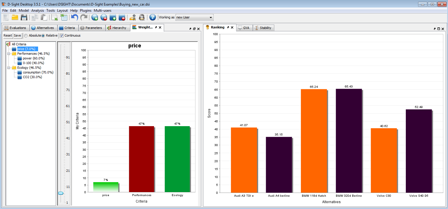
Let’s open the stability intervals tools (Analysis -> Sensitivity -> Stability Intervals). They indicate, for each criterion, the interval in which the weight can be changed without affecting the ranking. For instance, one can see in Figure 9 that the price (which is weighted to 40%) can be changed from 7,3% to 53,6% without changing the first ranked car. This can be checked it in real time by opening the walking weights (Analysis -> Sensitivity -> Walking Weights or CTRL + W). You can easily put this new tab in the left part on the main window by dragging and dropping it. Select the price criterion in the tree and move the slider to 54%. For this new weight value, the Audi A3 comes first in the ranking as more importance is now given to the price (Figure 10). On the other hand lower the price importance (note that the score of the BMW 1 series remains high) and you will see that the BMW 320d will come in first position (Figure 11). We can see with this quick analysis that the BMW 1 series seems to be a good choice as it is well scored and stays first even for a various range of weights.


