 English
 Français
Introduction
D-Sight Destkop is a multi-criteria decision aid software that has been developed in the CoDE-SMG laboratory of the Université Libre de Bruxelles (ULB). This laboratory is active in Operational Research since more than 30 years and is specialized in the field of multi-criteria decision aid (MCDA). It has provided valuable input to many industrial projects for well-known companies such as Elia, Solvay, La Police Fédérale, etc.
The CoDE-SMG laboratory is the inventor of the PROMETHEE and GAIA methodology. Those methods have been referenced world-wide more than 240 times; both related to the theoretical foundations and their application to actual decision problems.
From 2007 to 2010, the D-Sight software has been developed under the grant of the Walloon region in the CoDE-SMG laboratory. During the development phase, test cases have been realized with procurement departments of different large size companies to improve the software for the tenders evaluation problem.
Since March 2010, D-Sight Desktop is distributed through a spin-off company of the ULB, D-Sight, which has an exclusive license to commercialize the software.
D-Sight, Tenders Evaluation Software
D-Sight aims at helping the buyer in the tenders evaluation process. The tool is a formatted support that allows the buyer to easily introduce the data of the offers and the evaluation criteria. Furthermore, the user can specify the way he wants to evaluate each of the criteria. The data of the tenders and the complementary information given by the buyer are computed together to create a more advanced and interactive support that will help the buyer to choose the best tender, following a thorough yet quick analysis.
How to Use D-Sight Desktop in a Call for Tenders - Table of Content
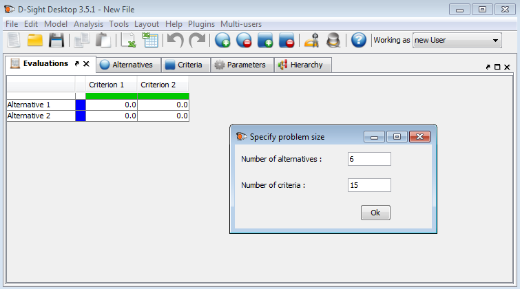
Let’s consider a company that wants to buy a new back-up system. The company’s buyer has received six different tendersoffers that needto be evaluated regarding 15 criteria that the buyer has defined. The buyer can easily define the size of the problem so that the software configures the environment automatically according to the settings.
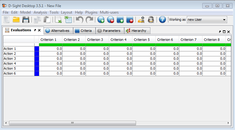
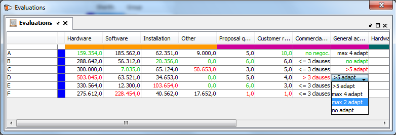
Figure 2 above represents the evaluation table in which each offer is represented in a line, and each evaluation criterion is represented in a column.
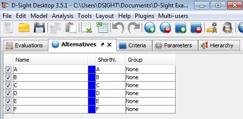
As shown in Figure 3, the user can introduce general information about the tenders. The first column (e.g. the checkbox) is used to easily enable or disable a tender and take the tender into account (or not). The second column contains the name of the provider. The three last columns respectively indicate the color, the short name and the group of the provider.
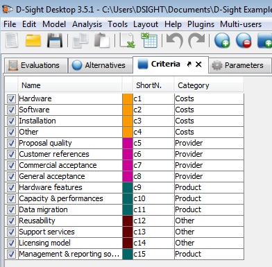
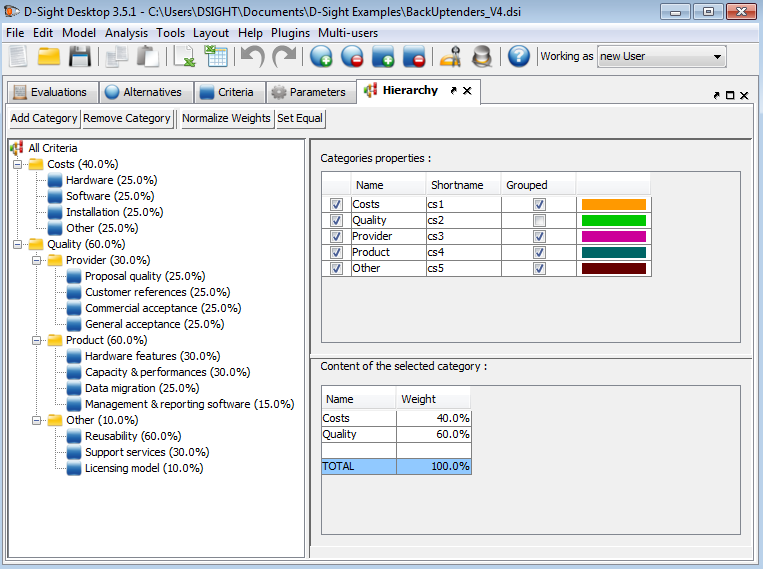
To structure the evaluation criteria, a hierarchy can easily be defined by grouping criteria into categories that can also be integrated in other categories, as represented in Figure 5. Each category has a specific color that is automatically applied to its inheriting criteria when they are represented in tables or charts. With the fourth column in the upper right panel, the buyer can choose to group or ungroup a category. If it is grouped, the category will appear in all the charts but not its inner criteria. On the opposite, if it is not grouped, it will not appear in the charts but its criteria will. The user also has to specify a weight for each criterion and each category. To assign a criterion to a category, the user has the option to use the last column of the criteria list (Figure 4) in which all the categories will appear if the cell is clicked.
Previously, we have represented the evaluation table that was also represented in Figure 2. The colors of the column have now changed according to the categories and the table has been fully filled out. The data can be quantitative as well as qualitative. For example, the “General acceptance” criterion is evaluated based on a scale specifically defined by the buyer. We will not explain in this document how to define those types of scales.
All data (evaluation grid, providers’ names, etc) can be imported from an Excel sheet and pasted in D-Sight in order to facilitate the overall creation process.
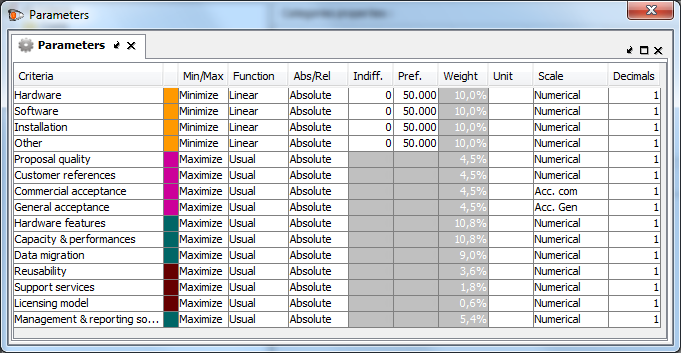
The last step for the user is to specify how he wants to evaluate the tenders for each criterion. That can be done in the Parameters tab represented in Figure 7.
For each criterion, the buyer first specifies if it has to be maximized or minimized but also the parameters of the PROMETHEE method. How does it work? For each criterion, pair-wise comparisons will be made between the tenders. The buyer has just to specify how he wants those comparisons to be made.
When comparing two providers A and B for a specific criterion, the software will transform a difference of performance (on the criterion) into a preference degree of A over B for this criterion.
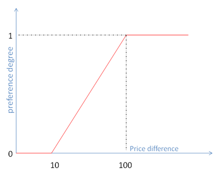
Preference functions, such as represented in Figure 8 are used. The buyer has to choose a certain type of shape and two other parameters:
- the indifference threshold: the difference below which no preference exists;
- the preference threshold : the difference beyond which the preference is strong
Several tools are available to analyze and evaluate the tenders but we will only focus on the most relevant for the problem that we are analyzing in this document.
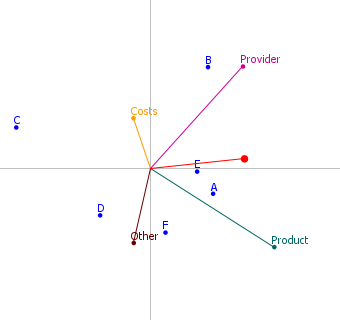
The GAIA plane provides visual analysis support. As shown in Figure 9, the providers are represented by the blue points and the criteria are represented by the different axis. Please note that the criteria are not represented “as is” but according to the buyer’s preferences (e.g. the preferences functions). This chart depends on two things:
- the tender offers and their gross criteria evaluations;
- the preferences function translating the way the buyer wants to evaluate these tender offers.
As the buyer has here defined a hierarchy, he can choose what he wants to see in the GAIA plane by grouping or ungrouping the categories. In Figure 9, the Costs category is grouped but not the Quality category. Provider, Product and Other are represented because they are grouped. For example, the buyer could choose to ungroup the Provider category. Its sub-criteria would then be represented instead of the category. Thanks to this plane and the “grouping” functionality, the providers can easily be compared on different level of details.
Different points can be observed:
- Relative positions of the providers: if two providers are quite close in the plane, as A and E in Figure 9, that means that their tender offers are ver similar.
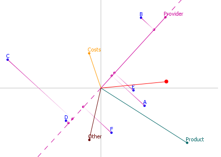
- Providers and criteria: an axis indicates the area in which the providers are good for the associated criterion. In Figure 10, the buyer can directly see that B is the best on the global provider quality (e.g. B’s projection on the Provider axis is highest up) and also scores hight on the global costs (for which C is actually the best offer).
- Relative positions of the criteria: if two criteria axis are in the same direction, that means that they are similar (e.g. in general, the tenders which are good for the first criterion are also good for the second). If two criteria axis are in opposite directions, that means that they are conflicting (e.g. in general, the tenders which are good for the first criterion are not good for the second). In Figure 10, the buyer can observe that on average, the providers who propose interesting costs are not good on the quality of the product.
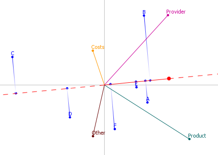
The red axis of the GAIA plane is the decision stick. It is obtained by using the weights of the criteria given by the buyer. It represents the compromise the buyer rationally has to make between the criteria. By projecting the tenders on this axis, the global ranking can be visualized.
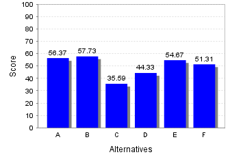
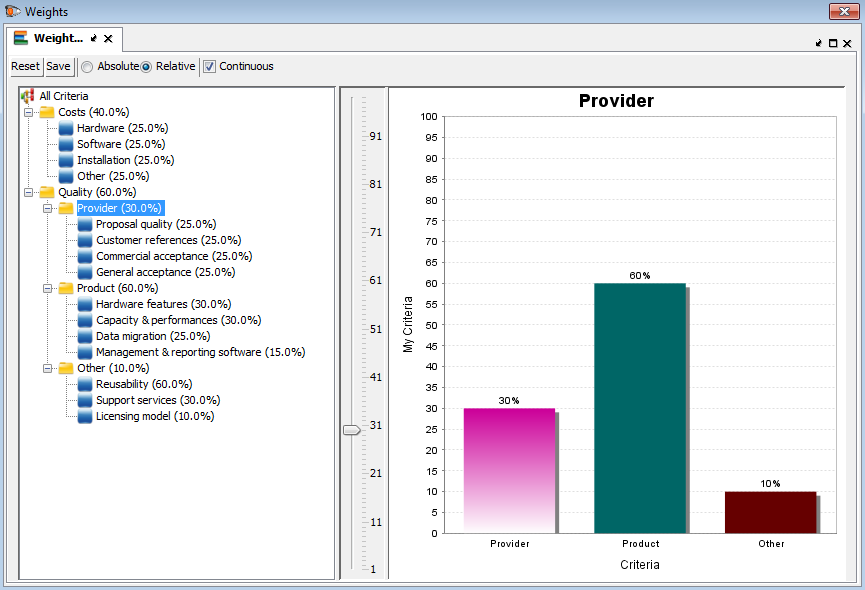
The weights of the different criteria can be visualized and dynamically changed in the window represented in Figure 13. When a weight is changed all the results depending on it, for example the global score bar chart or the GAIA plane, are directly updated. The user can then see the impacts of the weight change on the results. This can be done at different levels of the hierarchy tree. The [Costs,Quality] ratio can be changed or the [Hardware,Software,Installation,Other] ratio could be changed, etc.
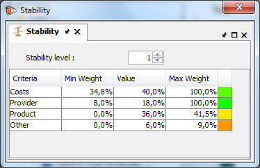
The stability intervals given in Figure 14 indicate how each criterion’s importance (e.g. the weight) can be changed without influencing the ranking. For example the Costs weight, which is 40%, can be changed between 34,8% and 100% and B will not lose his first place. Those intervals help the buyer to evaluate the robustness of his best tender offer. If the intervals are large, that indicates that the best provider has a “strong first place”. If the intervals are small on the other hand, caution must be exercised concerning the stability of the outcome.
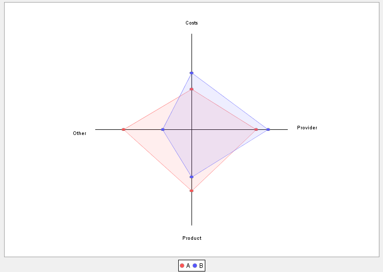
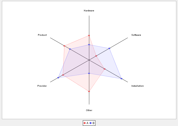
One last thing that we will illustrate in this document is how the buyer can easily compare two profiles of tenders. In Figure 15, we compare the profiles of the two first providers, A and B, on the global costs category and on the three quality subcategories. B is superior on the Costs and Provider and A is better on Product and Other quality subcategories. These profiles can be shown in lots of different ways by grouping on ungrouping the categories. In Figure 16, the user has ungrouped the Costs category and its sub-criteria are displayed. The most detailed view that the user can have is the one with all the sub criteria from the evaluation table, by ungrouping all the categories.
Data Output
All the grids and charts can be directly copy pasted into Excel or Word or any software interacting with the system clipboard. Reports can also be generated by D-Sight as an Excel or PDF file in order to help the buyer to communicate easily and efficiently with the management team.

